This post has several learning objectives:
- To contrast Statistical Thinking with standard Statistical Method.
- To compare evidence based medicine with Improvement science.
- To provide an integral view of statistical thinking with Improvement science.
- To Explore the Theory of Measurement underlying improvement science.
- To highlight the informatics of improvement.
- To provide a conceptual understanding of the need for control chart and the rules for its interpretation.
- To describe the various types of Control Charts.
- To provide a decision map for the use of Control charts.
- To describe the routines for control charts using Microsoft excel.
Statistics is the science of extracting information from a collection of data. The field of statistics as it is currently known to healthcare professionals is an offline, back end activity often limited to the analysis of data collected under control conditions of a research project. The methods of statistics in thus used to compare the relative benefit of particular interventions- e.g. drugs, tests, and the results are traditionally expressed as ‘p’values or confidence intervals. Such a traditional use of statistical methods presumably is an analysis of the cause –effect relationship and establishes the efficacy of the intervention. Such research due to its offline nature has often been referred to as ‘Meta Research’.
Statistical thinking on the other hand views statistics as a science of prediction. The very purpose of analysis is motivated towards the production of actionable data, by looking at data over time .Action in practice is progressive and dynamic and thus not under controlled conditions. Such an analysis is oriented towards change – effect relationship and establishes the effectiveness of the intervention. The tools used here a simpler, and are concerned with predicting results within limits and are analogous to confidence interval approach. Such research is due its ‘real-time ‘nature is often referred to as improvement science, practice based research or simply ‘Chrono research’.
The paradigm of evidence based medicine is founded on the more rigorous but less friendly techniques of statistical methods, while the paradigm of improvement science uses statistical thinking as one of its essential modes of understanding practice and effecting valid change at the workplace. Even though there is a much more complex and problematic epistemology involved in the justification of its use, I have used a simplistic distinction of efficacy and effectiveness to encourage the reader. The theoretical assumption underlying statistical methods is ‘certainty’ ie. an approximation towards truth, whereas statistical thinking is content with pragmatic objective of what works and thus has a broader practical value.
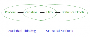
As a parody of the statistical method, statistical thinking can be depicted thus:
In our section on the informatics of improvement we will use the above framework borrowed from the work of Richard Scoville and David Kibbe in the mid 90’s at Future Healthcare in Chapel Hill, North Carolina.
However, Statistical Thinking has several theoretical and practical assumptions that are different from statistical methods and thus schematically elaborated as:
The use of statistical thinking is relatively new in healthcare , though the origins in industry is based on the work of Walter Shewart in the 1920’s and later elaborated by Edward Deming as component of his ‘ system of profound Knowledge ‘: Systems Thinking, Statistical Thinking, Psychology and Epistemology. This should clarify that improvement science involves more than statistical thinking. The precise methodology that integrates statistical thinking and practice of improvement science is analogous to the scientific method and is famous as the PDSA.
While the PDSA , known outside healthcare as PDCA, was intended as a systematic process for carrying out improvement at the industrial shop floor. It was meant to bear the role of the scientific method . an interesting decription of the process was offered by progress ltc . At point I wish to merely clarify the confusion between the words ‘do’ and ‘act’. Do is a verified plan , act is a validated plan. It has demonstated impact and thus based on knowledge.
Based on the PDSA method we define Improvement science as the cumulative effectiveness of systems change under bounded predictability. The limited predictability may be the result of uncertainty, complexity or limited resources. Statistical thinking addresses the component of uncertainty or unwanted variation in the process. The idea of bounded predictability is also a description of the nature of statistics as a field, as predictability works only for a group of data, over short time span and that too within a reasonable set of boundaries or limits. This principle is the basis of analysis of time series and the conceptualisation of the control chart by Shewart.
The American society for quality defines statistical thinking as: ‘Statistical thinking is a philosophy of learning and action based on the following fundamental principles: 1. All work occurs in a system of interconnected processes. 2. Variation exists in all processes and 3. Understanding and reducing variation is key to success.
The idea of actionable data has several assumptions:
- It is enumerative data, not historical data. Increasingly the time frame for the data may be progressively decreased for example from week, to day, to shift.
- That data is collected for a specific purpose: Based on Practice Hypothesis. [Improvement study design is based on system principles and thus always has a Hypothesis. However, the methodology does not have hypothesis testing. It is a common mistake to say there is no hypothesis in audit and improvement work. The improvement study is usually ‘Before – After’ design.
- The data sets are generally small and random sampling techniques may be used.
- That the data includes ‘contextual variables ‘which usually in standard research design would be excluded as confounding variables.
- Graphical Techniques are prominent in both analysis and display.
- Individual Identification data may be retained in the analysis. Example, physician, shift etc. May require stratification or risk adjustment.
- Data is viewed over time.
- The data is provided by the process.
- The data plotted on a control chart is the outcome not the process.
- Usually, the data collection process is terminated at the end of the project. Data for testing and data for monitoring have different purposes.
- While standard statistical methods are concerned with ‘quality of inference’, statistical thinking is also particular about ‘quality of data’.
The principles of collection are not dealt with in this blog. The idea of cumulative impact underlines the fact that the effect is analysed formatively not summatively. The classical use summative analysis usually involves some form of hypothesis testing and controlled comparisons. The cummulative impact also highlights the multifactorial approach problem solving.
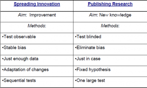
It is convenient to review the distinction between improvement science and traditional research :
Regardless of the emphasis of variation in the Statistical Thinking category, it will do well to remember that the business of both statistical method and statistical thinking is variation. The common textbook example, I have used in classroom to answer the question Why we need statistical manoeuvres is worth considering here:
Consider the following table Experiment results of number of word recalled with and without a memorization technique.
By looking at the data without doing any calculations what conclusions can you draw about the results of the four different experiments.
We could employ various strategies to draw conclusions about the intervention compared to performance without intervention. Our intuitions are not equally helpuful in all four experiments. This has to do with the centering and spread of the datasets in each of the four experiments.It is likely that most people are convinced of the effect of the intervention in experiment 1 and the negative effect of intervention in experiment 4. This would also be supported by comparing the averages.
Merely looking at the data alone may not have been useful in the case of experiment 2 and experiment 3. Needless to say this difficulty is due to the presence of variation in the datasets.it is this overlap that is caused by the variation in the dataset that requires us to use statistics to make sense of the results. If the four experiments were repeated we would get different datsets and thus different averages.
Are intuitive conclusions would have been even more certain if there was absolutely no overlap of the data in these cases. Statistical test are useful to make sense of data in the presence of variation. If you are curious about what type of statistical would be applicable, this YouTube video would be interesting: Choosing a statistical test.
Theory of Measurement in Improvement Science: The idea of statistical thinking as cumulative effectiveness.
Most tools of quality improvement begin as concepts and over a period of time evolve into tools. Measurement can be distinguished as ‘Measurement for Judgement’ or as ‘Measurement for Improvement’. Traditional quality assurance and conventional research falls in the first category while improvement science belongs to the latter. Improvement philosophy underlying the former is ‘trimming the tails’, while the latter is concerned with ‘shifting the curve’. The underlying theory of ‘trial and learn’ serves to drive the process of improvement.
Computer surveillance of the electronic medical record will soon be able to identify 3 patterns of deficient care, only the first of which was identifiable in the past.
The first pattern—a dramatic deviation from the expected outcome, as in the sentinel event of unexpected death—was the subject of historical quality assurance. The second—a reasonable outcome despite a less-than-optimal process—is a warning that the system is not in control and may deteriorate further, resulting in an adverse event or a pattern of preventable morbidity. As an example, consider increasing delays in emergency department triage time. At first, the increased delays are merely disturbing; however, should a critically ill patient present, the previously disturbing delay can prove catastrophic. The delay is a latent error—an accident waiting to happen.
The third category—a reasonable outcome with an acceptable process that might be further improved beyond the prevailing standard—will soon be identifiable with computerized clinical tracking. As an example, there has been a common practice of keeping patients with uncomplicated community-acquired pneumonia in the hospital on intravenous antibiotics for 1 day after their fever has remitted. Given that few of these patients require intervention on their last day, a careful review would show that an earlier discharge would arguably be appropriate, thus lowering costs and reducing the risks of iatrogenic complications.
We can represent a data set both as a histogram and a run chart . The histogram while convenient and for particular purposes such as comparisons, is informative. However, the disadvantage of a histogram is it provides a cross-section of the data and thus hides the sequence.
The run chart can schematically be viewed as a histogram turned on its side and as the same data displayed over time. The time based data provides us a chance to intervene. Vahe Kazanjian of the Maryland Quality Improvement Collaborative often uses an analogy to emphasis this point. Imagine a shooting target with the following result:
While we can make a judgement based on the location of the bullet marks whether the person was a good shot or not . The availability of the sequence would have allowed us to correct our shooting. If black was the first shot then the shooter has been improving. Looking at data over time creates room for action.
The above two examples are only given to emphasize the important of time based data and are not offered as a methodological concept. Most processes are by nature stochastic and thus require specific tools to analyze.
Having said this statistical thinking gives us a way of describing the process, in terms of variation.But this requires a richer description of variation in general . Shewarts thesis of the function of the control chart is to distinguish between variation that always present in the process and variation that is idiosyncratic. He uses the term common cause and special cause. The control chart is often used as the totem for the philosophy of statistical thinking . The central question of statistical process control is : Given data with variation, how can we establish thresholds for action that accurately distinguishes special cause and common cause variation .
Brian Joiner in his classic , Fourth Generation Management
Here it may be useful to introduce two approaches to establishing a limit or a threshold. The first is standard or norm which is usually applicable to all place and time and the other being a reference threshold , that is limited to particular place and time. The control chart is not a dignostic tool but more a tool for monitoring the health of the process and to assess interventions on the process. Most physicians and nurses have at some point come across or used growth monitoring chart and thus one could for pedagogical convenience draw an analogy to Childrens Growth Monitoring Chart, even though the curves represent percentiles and are derived from population based studies. The WHO growth charts use standards based thresholds and thus fix the expected growth profiles for the different age groups. On the otherhand , the control charts thresholds are an example of refrence thresholds and are derived locally from the prior or baseline performance of the process.
Using Data to Represent Systems:
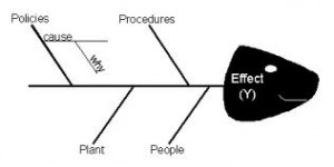
The system of interest can be represented in several ways: A flow chart is a representation of the system. A histogram is also a representation of the system. A fish bone diagram is a representation of the system. The run chart and control chart is a representation of the system. A organization chart and a team are also representations of the system.
Data can be used to represent two properties of systems : Coherence or interdependence and secondly of Flow.
Representation of Coherence or Process dispersion:
A. Fish-Bone Diagram.
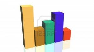
B. Histogram.
Representations of flow:
A. Process Flow Chart.
B. Control Chart.
Efficiency is a part of any scientific method.


